Dietitian
Izabela Goj-Michalik is a clinical and bariatric dietitian working with people through long-term dietary change. The brand was built to reflect the specialist herself — warm, experienced, holistic — someone who looks after the mental side of the work as much as the measurable one.
Izabela Goj-Michalik is a clinical and bariatric dietitian working with people through long-term dietary change. The brand was built to reflect the specialist herself — warm, experienced, holistic — someone who looks after the mental side of the work as much as the measurable one.
Industry
Medical professional
Medical professional
Date
2026
2026

Symbol Made of Four
Symbol Made of Four
The logomark folds four elements into a single shape — bowls, a face, a heart, and a leaf. Each one carries a piece of the practice: bowls for mindful eating as a daily ritual, face for change that begins from within, heart for knowledge held alongside care, leaf for healthy food understood as pleasure rather than restraint. Together they read as one calm, generous mark.
The logomark folds four elements into a single shape — bowls, a face, a heart, and a leaf. Each one carries a piece of the practice: bowls for mindful eating as a daily ritual, face for change that begins from within, heart for knowledge held alongside care, leaf for healthy food understood as pleasure rather than restraint. Together they read as one calm, generous mark.
The logomark folds four elements into a single shape — bowls, a face, a heart, and a leaf. Each one carries a piece of the practice: bowls for mindful eating as a daily ritual, face for change that begins from within, heart for knowledge held alongside care, leaf for healthy food understood as pleasure rather than restraint. Together they read as one calm, generous mark.
Warmth in gradient
Warmth in gradient
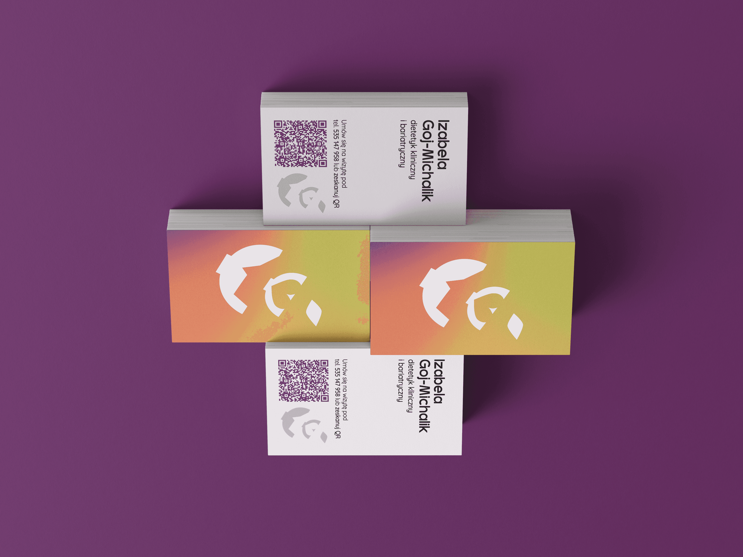
The visual system moves through a gradient palette of yellow, orange, green, terracotta and violet — colours chosen to feel human rather than antiseptic. Type stays grounded and direct, leaving the gradients to do the softening across letterhead, business cards, branded pens and the nutrition plan. The system carries the same idea throughout: brand identity design for a practice where dietary change is treated as something whole, not just a number on the scale.
The visual system moves through a gradient palette of yellow, orange, green, terracotta and violet — colours chosen to feel human rather than antiseptic. Type stays grounded and direct, leaving the gradients to do the softening across letterhead, business cards, branded pens and the nutrition plan. The system carries the same idea throughout: brand identity design for a practice where dietary change is treated as something whole, not just a number on the scale.
The visual system moves through a gradient palette of yellow, orange, green, terracotta and violet — colours chosen to feel human rather than antiseptic. Type stays grounded and direct, leaving the gradients to do the softening across letterhead, business cards, branded pens and the nutrition plan. The system carries the same idea throughout: brand identity design for a practice where dietary change is treated as something whole, not just a number on the scale.

Projects
Explore more like this one
Selected projects that reflect my approach to design, development, and execution.